What Can Social Media Do For Your Dealership?
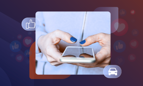
Turning Likes into Leads
Social media has become one of the most powerful sales tools in automotive retail. Every day, customers scroll through Facebook and Instagram comparing prices, styles, and finance options—long before they visit a forecourt. Yet for many dealers, turning that attention into real sales is still the missing link.
That’s where a social media package for car dealerships comes in. Click Dealer helps turn online engagement into qualified leads with tailored content, targeted Facebook Ads, and expert management built specifically for the automotive market.
The Benefits of Social Media for Car Dealers
Social media is more than a place to share new arrivals or a “car of the week.” When managed properly, it becomes a lead-generation engine that works 24/7.
Here’s how it pays off:
- Reach local buyers instantly. Facebook and Instagram remain two of the most effective platforms for car advertising—putting your vehicles in front of people actively looking for their next car.
- Build trust before contact. Regular posts showcase stock, finance options, and reviews, helping customers feel confident before they enquire.
- Drive measurable sales enquiries. Paid campaigns, retargeting, and custom audiences turn likes into test-drives and finance applications.
If you’re managing your own channels, start with our tips on five social media ideas to keep your dealership engaging. When you’re ready to scale, our automotive social specialists can take it from there.
Improve Your Social Media Presence with Click Dealer
Running effective Facebook Ads takes more than a boost button—it needs data, creativity, and consistency. That’s why our automotive social media package is designed around what actually converts.
With Click Dealer, you get:
- Content creation and scheduling – professional posts designed to match your dealership’s tone and brand.
- Paid campaign management – audience targeting, creative testing, and ad spend optimisation for better lead quality.
- Performance tracking – transparent results through your Click dashboard, so you can see what’s working and why.
- Automotive insight – decades of motor-trade experience ensure every post and advert speaks your customer’s language.
Our campaigns are built for lead generation from social media, not just brand awareness. We don’t just post cars—we help dealers grow. Our team understands stock rotation, finance integration, and the nuances of car advertising Facebook strategies that actually convert browsers into buyers.
Explore our full automotive social media marketing services or see how to build customer trust with our Building Trust, Building Presence webinar.
Your Next Buyer Is Already Scrolling
Social media isn’t optional—it’s where modern car buying begins. Whether you’re looking to refresh your brand presence or launch targeted Facebook Ads that deliver high-quality leads, Click Dealer has the experience, insight, and data to make it happen.
Let’s turn your followers into customers.
Enquire about our automotive social media package today.